CLIENT:
Franklin
MY ROLE:
Senior Visual Designer
TIMELINE:
Jul 2019 - Oct 2019
AGENCY:
Digital Operative
OVERVIEW
Franklin is a family-owned, global sporting goods brand, since 1946. Franklin is affiliated with the best in sports including world-class athletes.
The challenge was to visually enhance their experience and restructure their navigation to increase revenue.
ROLE & RESPONSIBILITIES
I was the sole designer on this project. I collaborated with an optimization architect, product manager, a creative director, and, a team of engineers.
I was involved from the beginning to completion.
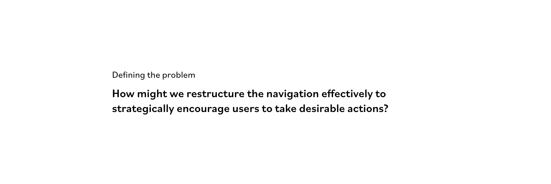
PROBLEM
Problem Statement
Currently, users struggle to find the right path to content.
DEFINING SUCCESS
User goals
- Restructure the navigation to drive sales.
- Improve conversion and engagement.
- Elevate the product story by enhancing its visual aesthetic.
UNDERSTANDING THE USER
I needed to understand how users seek and discover unexpected but relevant items. So, I took a look at the provided qualitative and quantitative customer research and used card sorting as a research method to understand how users think about the content. Uncovering the users’ behavior helped create an information architecture that matched the users’ expectations.
EXPLORATION
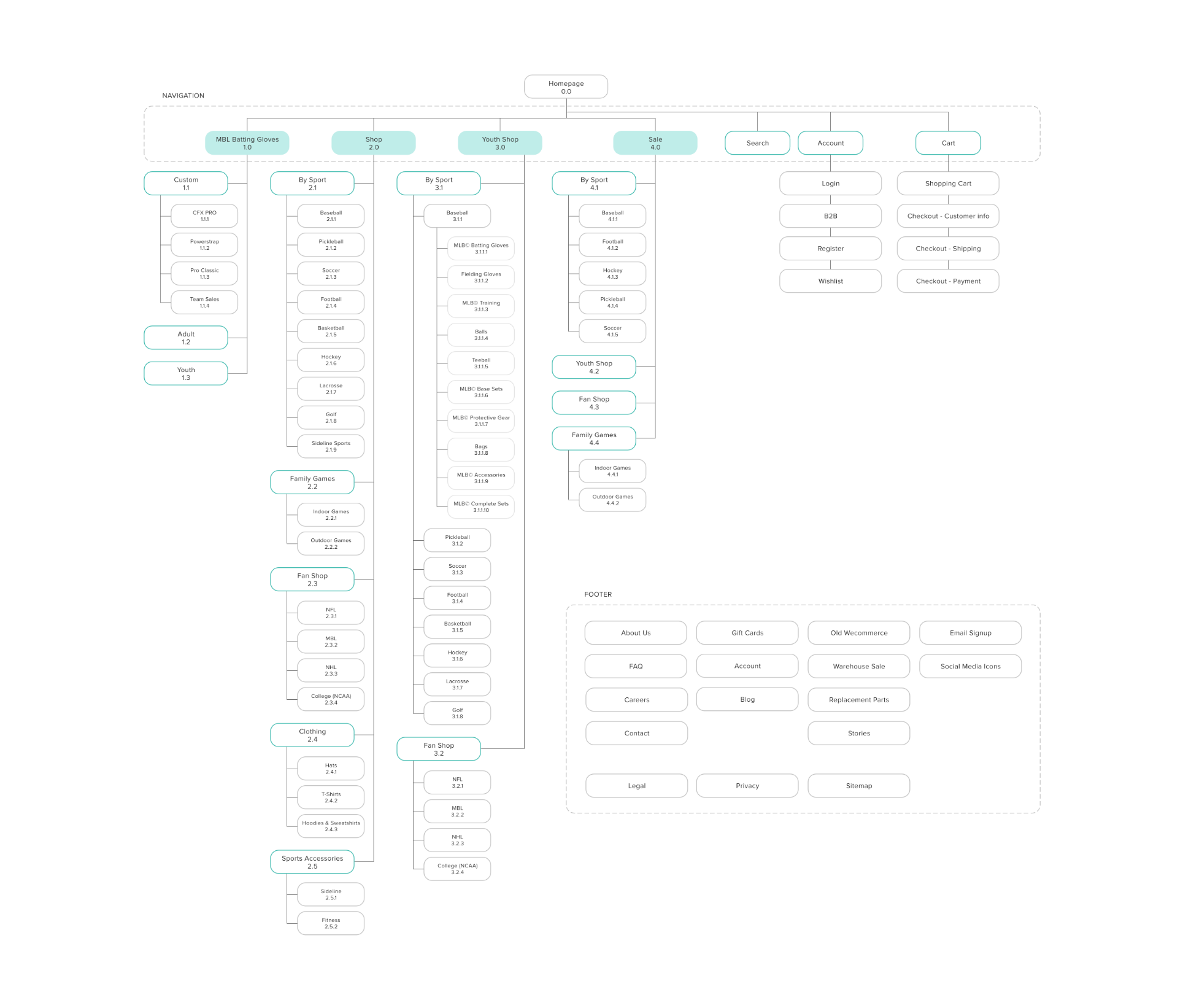
Old Sitemap
Before content was structured based on what made sense to the company, not to the users. Limiting this site to only 4 main categories made it much harder for visitors to discover the full range of products. Users weren’t able to clearly distinguish between similar navigational categories, and they struggled to find the right path to content. Users dropped when choosing the “wrong” category and couldn’t find what they were looking for.
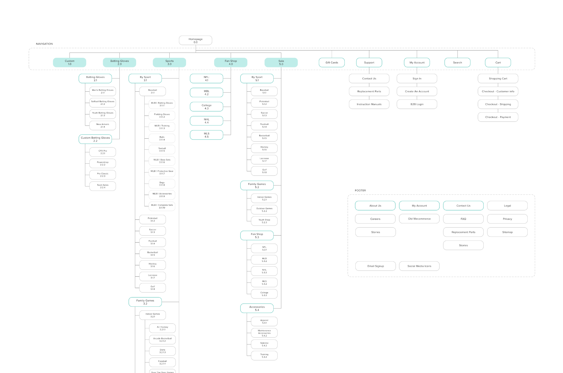
New Sitemap
To improve it, I added one main category and sub-categories and used a polyhierararchical IA structure. Having the same product category appear in multiple places helped users find what they were looking for.
FINAL DESIGNS
Everything was designed mobile-first, targeting their audience wherever they spend their time. Having a user-friendly mobile presence was a crucial piece.
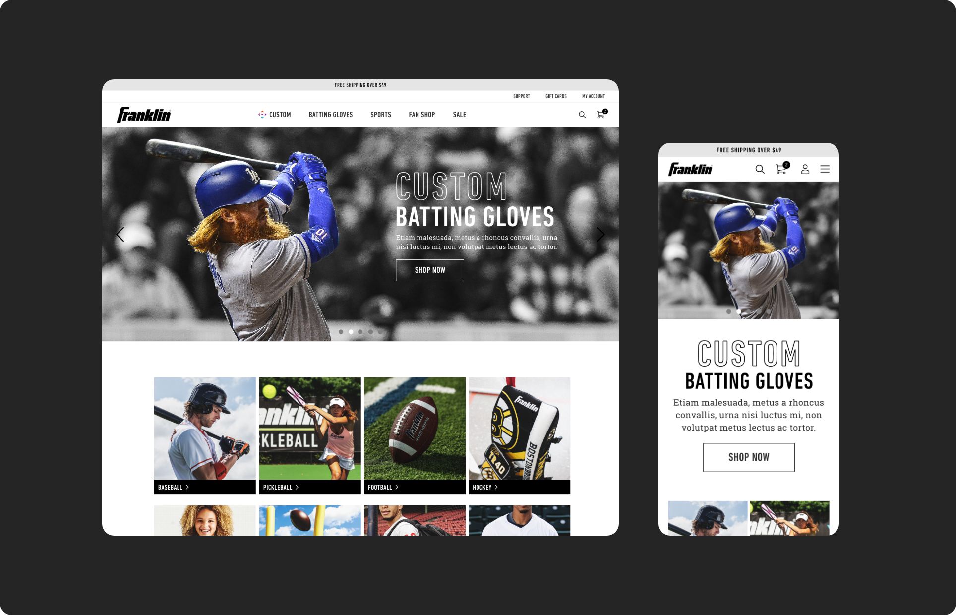
HIGH FIDELITY DESKTOP PROTOTYPE
The primary goal of the navigation was to help users find information and functionality and encourage them to take desirable actions.
I reworked the side cart checkout, I made the bottom portion of the side cart sticky, to have the CTAs accessible at any time to increase conversion.
I also worked on the search feature. I added advanced search to it, the user not only sees product results but also category results, giving the user a bigger opportunity to find what they’re looking for.
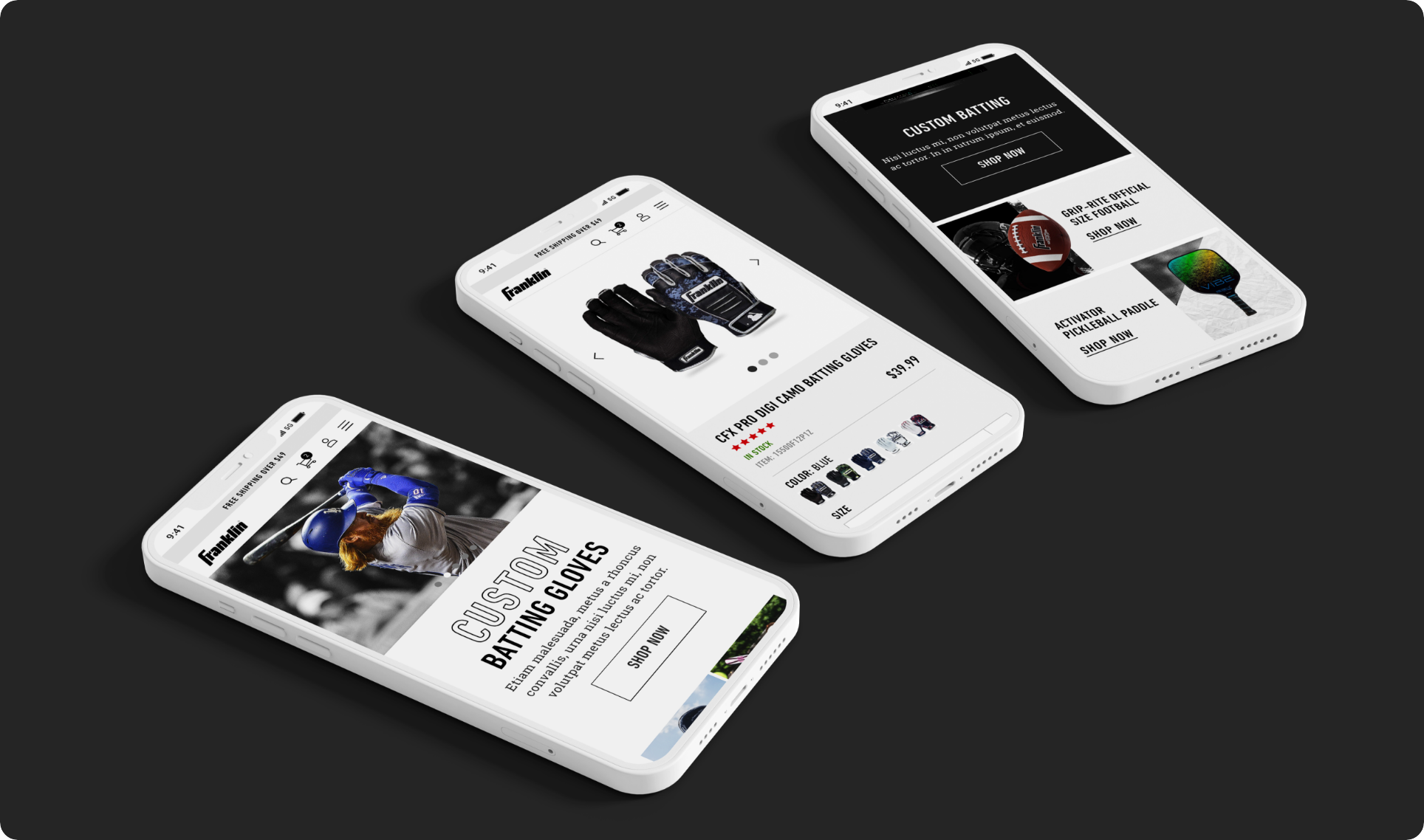
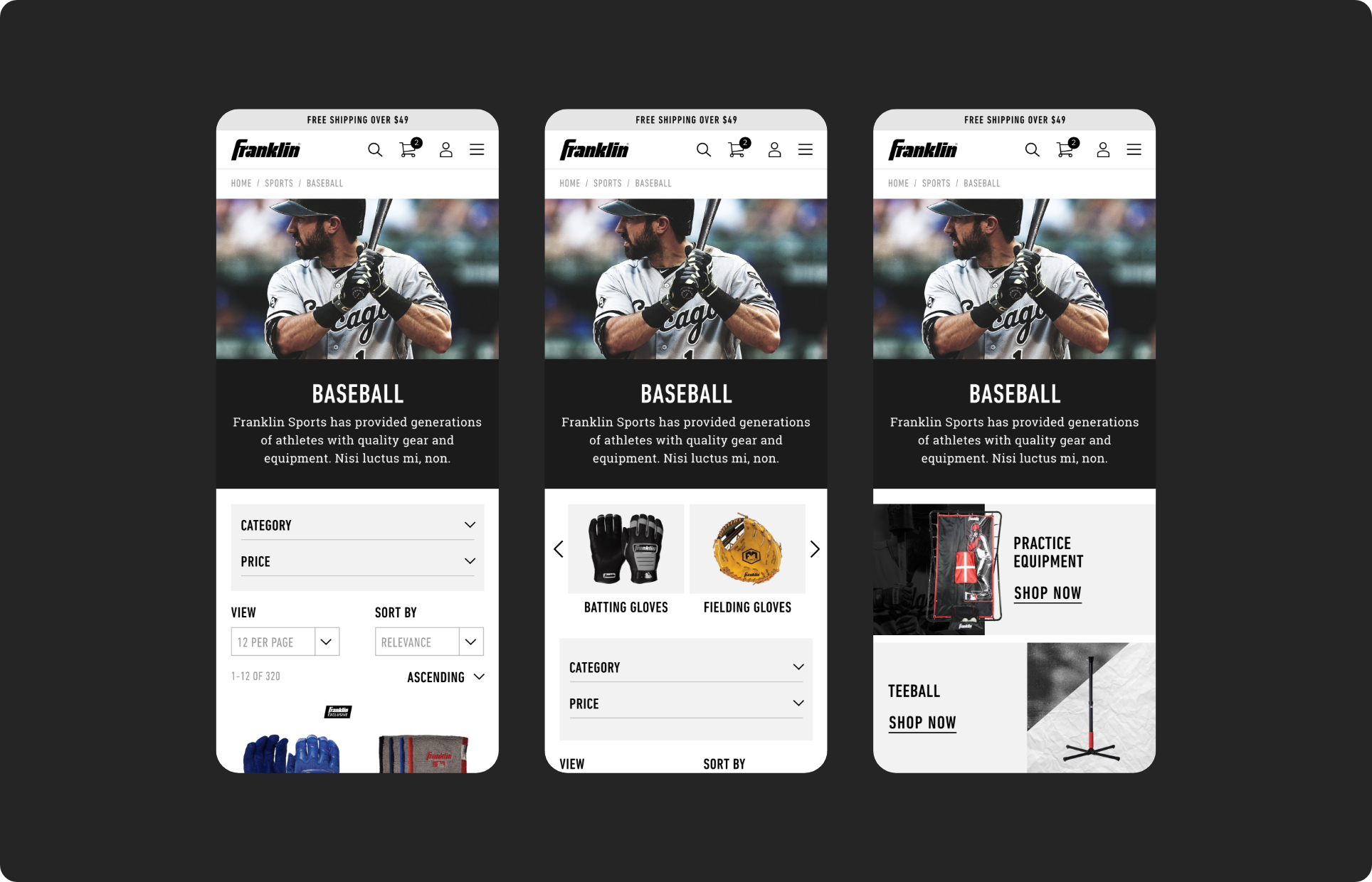
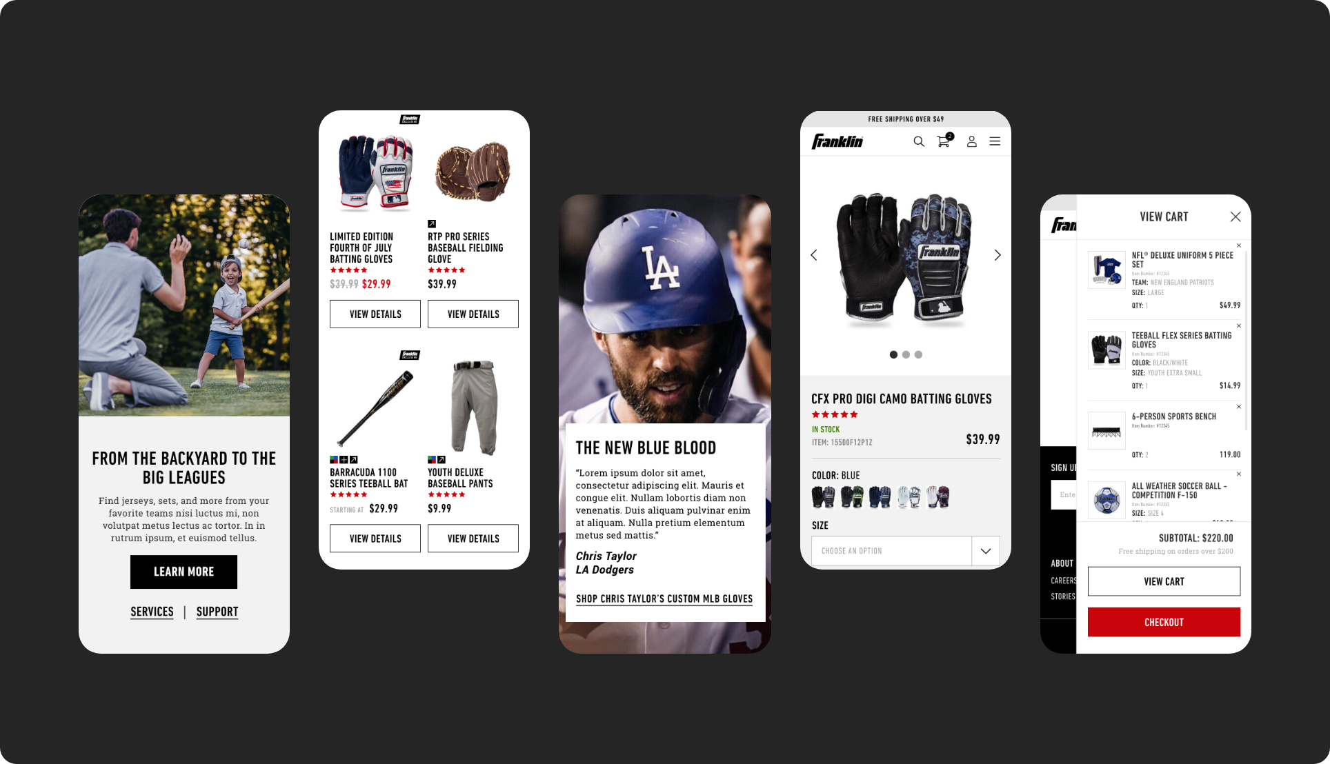
HIGH FIDELITY MOBILE PROTOTYPE
I made sure that the navigation structure and flow stayed the same on mobile and I made accessibility a priority when translating the design to a smaller screen size.
I created content blocks that feature products that can easily be updated regularly to serve as motivational touchpoints.
I also enhanced the overall visuals of the homepage to align with their target demographic.
NAVIGATION STRUCTURE
Data confirmed that visitors were having difficulty finding the product that they were looking for so to help with that I decided to create 2 different modules to test which one performed better.
The first one without any implementation, the 2nd one with a category slider placed at the top, and the 3rd one with a module consisting of 3 elements to drive users to a specific category or product.
After these value points were tested, the one in the middle resulted as the top performer and was the one that was implemented as a result.
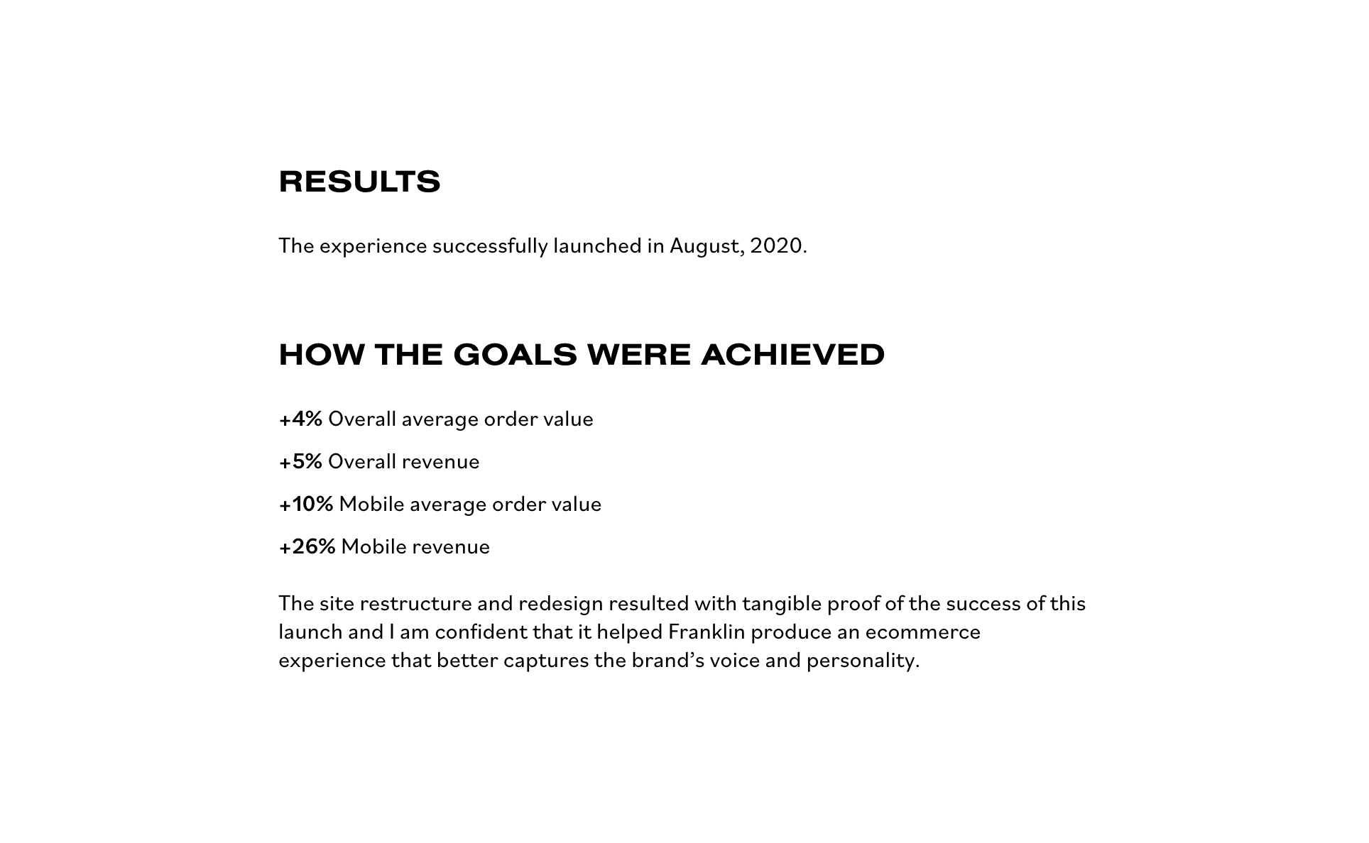
GOING FORWARD
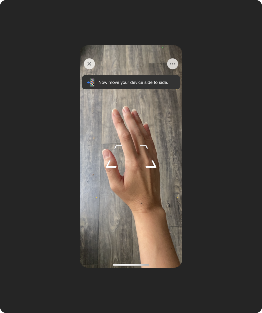
Incorporation of AR
One big thing that I think would be extremely beneficial to Franklin is to add Augmented Reality to their custom gloves configurator.
As more sites and apps begin to take advantage of AR, it will slowly become more expected and users will learn how to use it. I think it would be of great value for the experience.
TAKEAWAYS
Voicing of the user
I am glad that I kept the process user-centered. Otherwise, I wouldn’t have been able to look at the problem with neutrality, nor spot some usability issues in my original design.
Small changes
I am glad to learn that even by making small changes, I was able to yield big impacts and create a great experience for users.
WHAT I WOULD DO DIFFERENTLY?
I would have liked to conduct a complete heuristic evaluation of the website to further assess roadblocks to motivation cues and friction points that could impede the customer from making purchase decisions.
BROWSE OTHER PROJECTS