CLIENT:
Clark’s Botanicals
MY ROLE:
Senior Visual Designer
TIMELINE:
Jun 2019 - Sep 2019
AGENCY:
Digital Operative
OVERVIEW
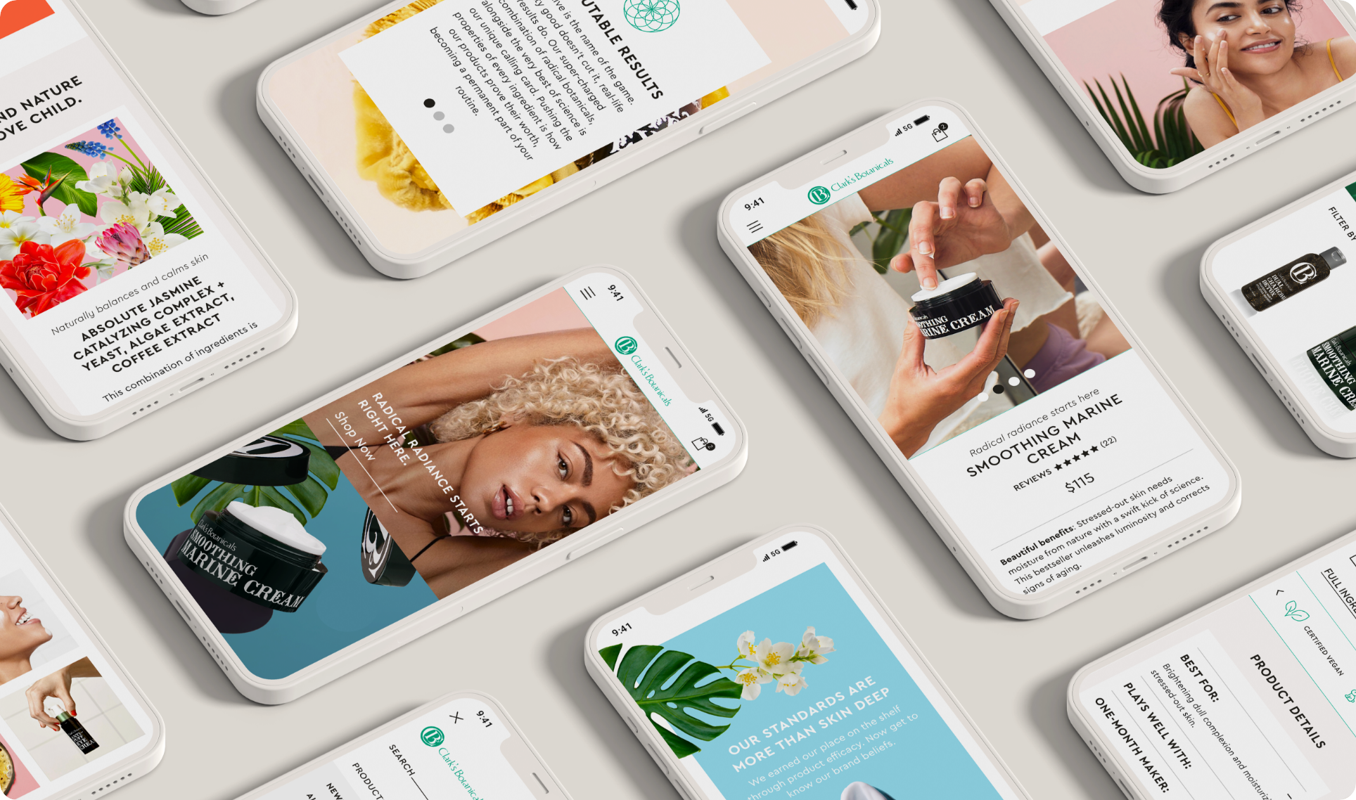
Clark’s Botanicals is a New York-based skincare company with an energetic personality and avante-garde products.
The goal was a complete website redesign to increase conversion to drive more sales.
ROLE & RESPONSIBILITIES
I was the sole designer on this project. I collaborated with a product manager, a creative director, a copywriter, and a team of engineers.
I was involved from project concept through execution.
PROBLEM
Problem Statement
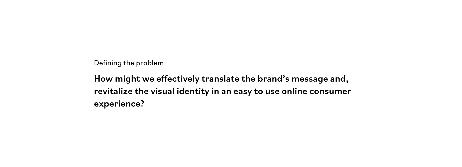
The current experience is not intuitive and is outdated, causing a low conversion rate.
DEFINING SUCCESS
Improving the UX of the experience
The current website was not easy to navigate.
Creating a visual identity
Align with the new rebrand.
Building an interactive mobile experience
Over 85% of their audience comes from a mobile device, so an intuitive interactive mobile experience was a must.
UNDERSTANDING THE USER
I needed to understand the user, I took a look at the provided consumer research with data analysis, and conducted stakeholder interviews to define the optimal customer pathways. Then I then conducted a competitive analysis that showed what competitors had accomplished and where they fell short.
EXPLORATION
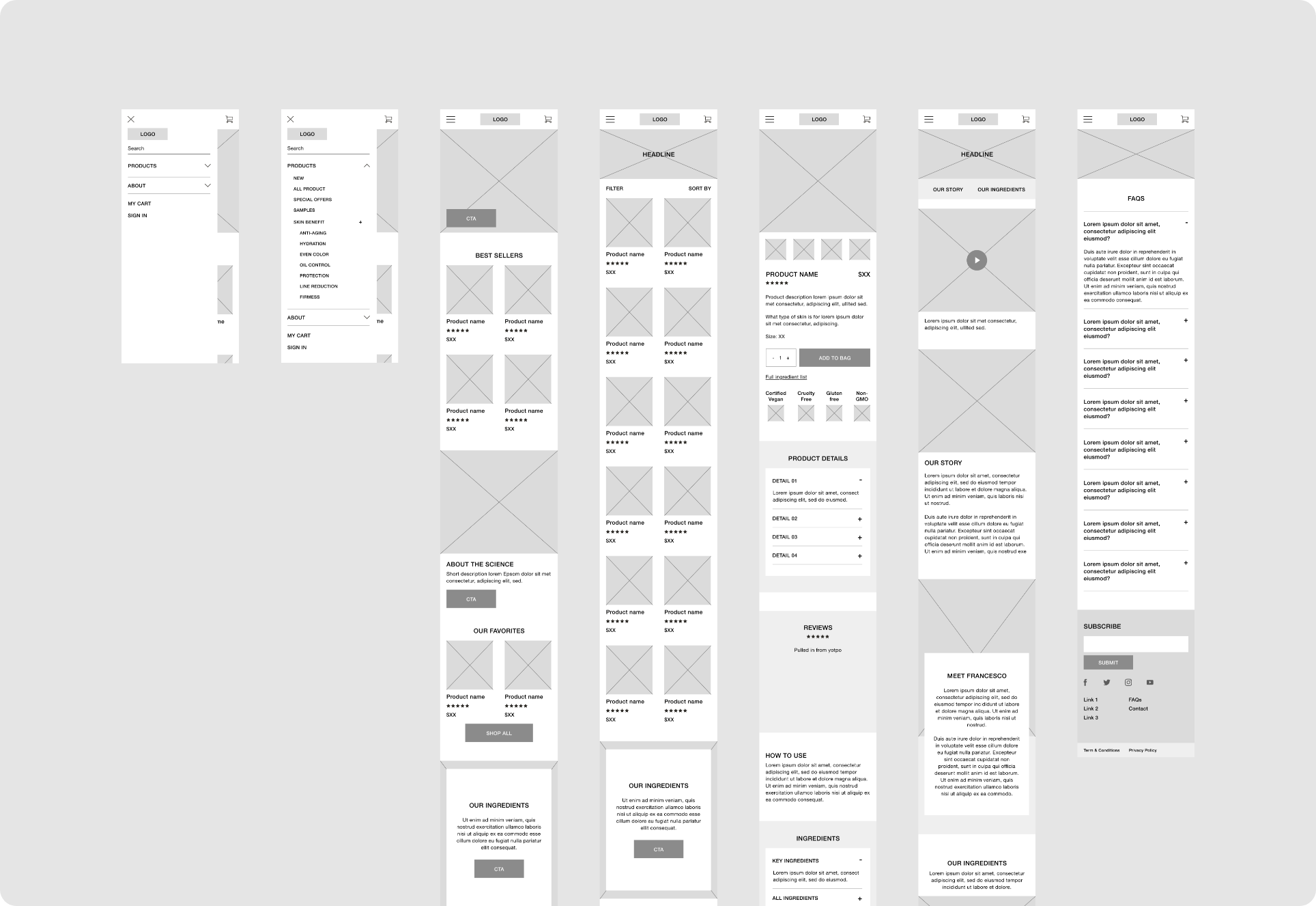
First, I needed to understand key pain points, second, categorize all insights gathered, and lastly, present them to the internal team and stakeholders.
After that, I mapped user needs to different phases. With a full map of information, I was able to create the site structure and convert it to usable information architecture and wireframes.
FINAL DESIGNS
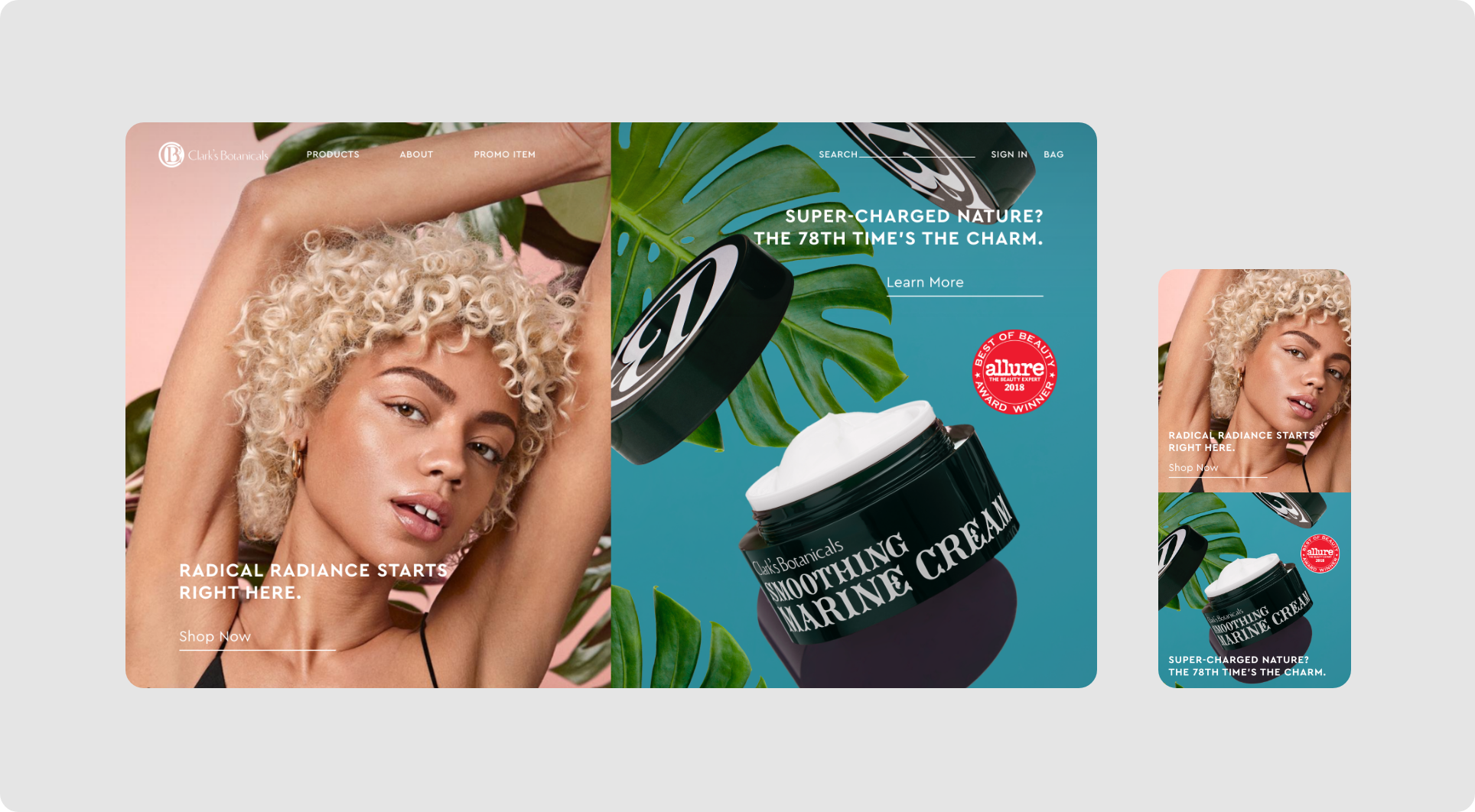
I designed the experience to be responsive to ensure functionality across a wide variety of screens and devices. My job was to effectively translate this brand message revitalize the visual identity and expose their compelling product stories.
MOBILE FLOWS
These are some of the mobile flows and user interactions I created based on the research and insights done at the beginning of the project.
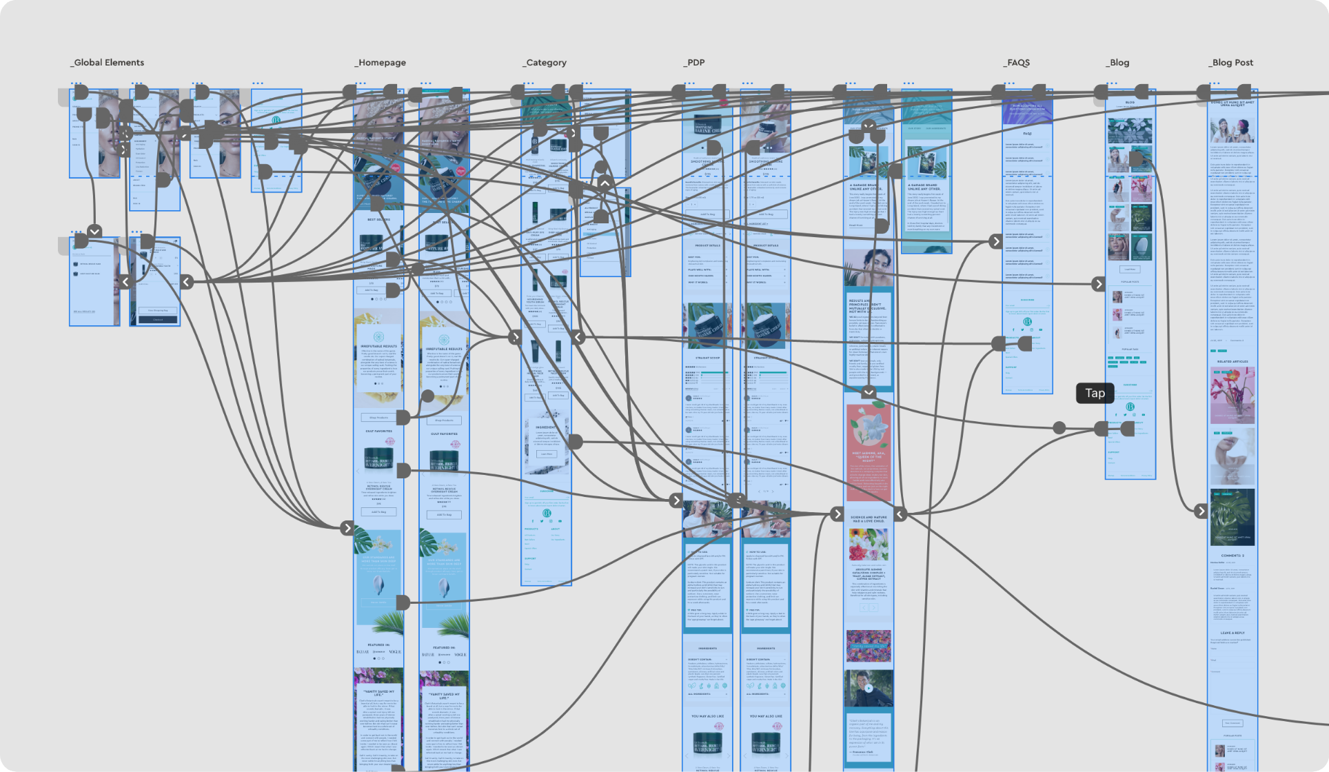
The design of the website was actually in parallel to the brands’ rebranding. Some of the goals were to make the website flow more intuitively and effective and make it more modern, sophisticated, unique, and fun since they wanted to attract a younger audience.
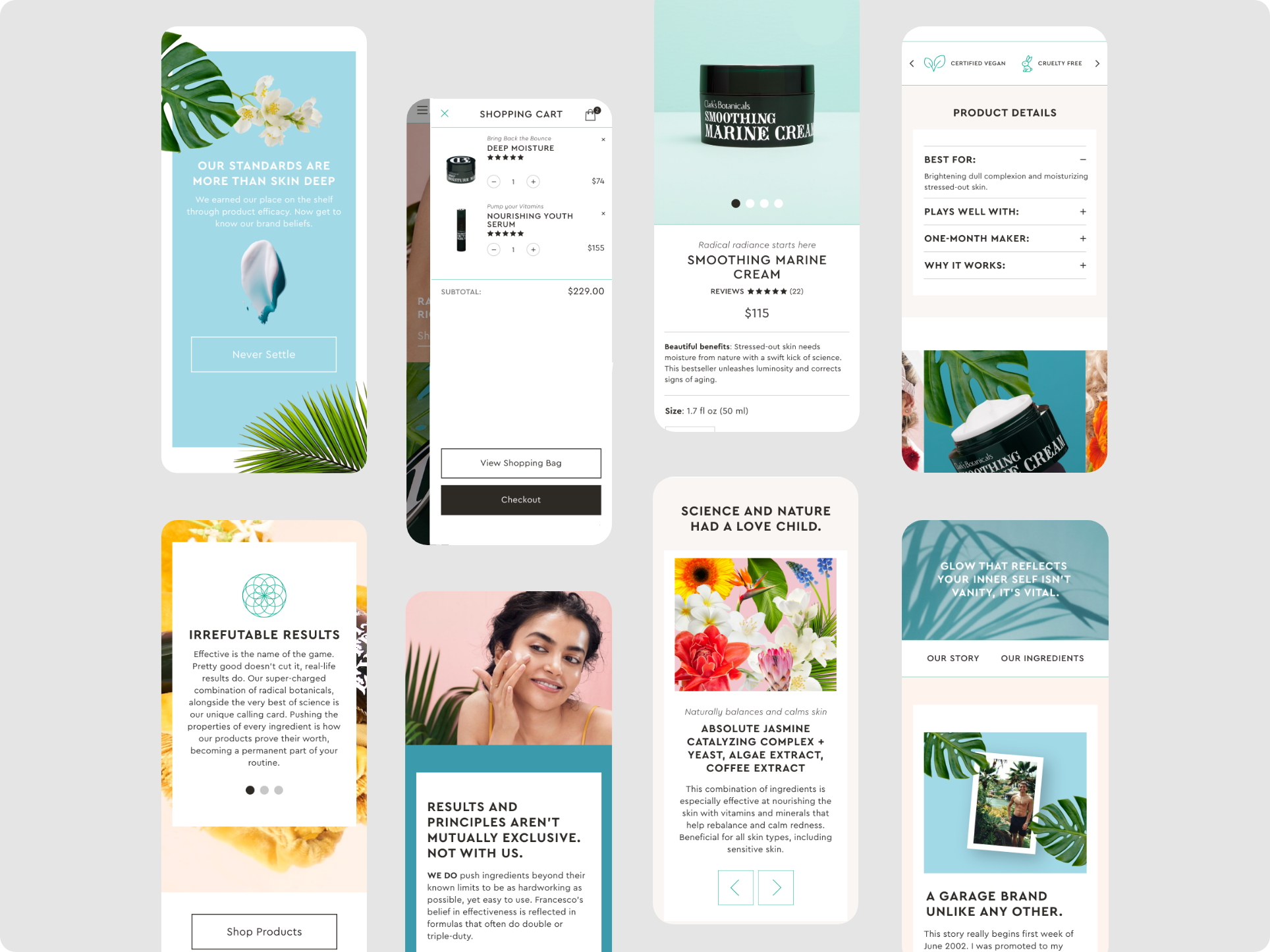
HIGH FIDELITY MOBILE PROTOTYPE
I wanted to translate the brand’s personality into an engaging shopping experience and effectively translate its message.
I also focused on the interaction of the experience. I reworked the navigation structure to make it more intuitive. I also added a side cart to allow users to access the cart from anywhere without going to the cart page. I made it a priority to have a selection of products at the top of the page to add engagement and increase conversion.
I added filtering on the catalog page to help the user find a product quicker based on their needs.
I also reworked the structure of the PDP, data showed that users struggled to find the right information about the product so, I made it a priority to fit all the main details in a more organized and accessible way. Creating a better overall layout and better hierarchy.
HIGH FIDELITY
DESKTOP PROTOTYPE
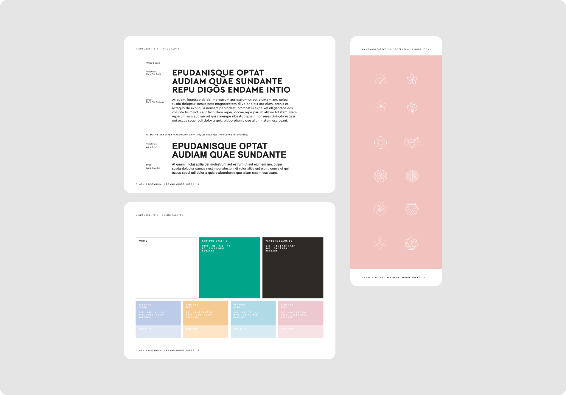
VISUAL DESIGN SYSTEM
I worked closely with the agency responsible for the product rebrand and aligned on colors, fonts, iconography, and the overall look and feel of the new brand.
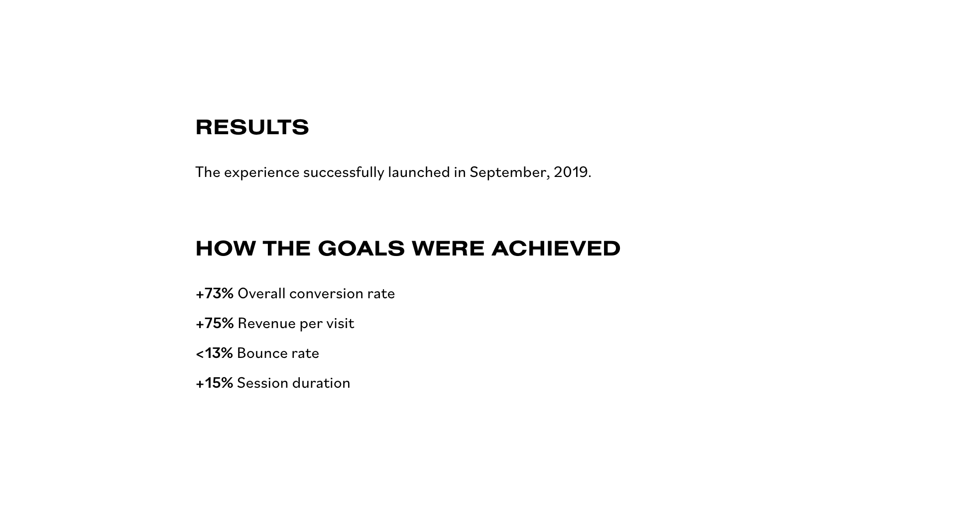
IMPACT
Feedback from stakeholders and users was very positive.
Here’s a quote from a stakeholder:
“I am amazed by the results of the work. Great understanding of where the brand currently is and where it should be in the future.”
AWARDS
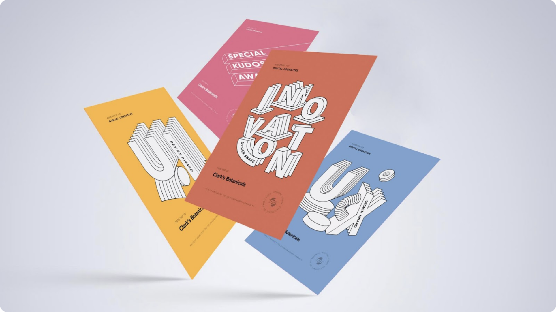
CSS Design Awards
The new experience won Best UI Design, Best Innovation Design, and Best UX Design.
TAKEAWAYS
Adapt to the changing timeline
Adapt to budget constraints
How to accomplish more with less.
WHAT I WOULD TO DIFFERENTLY?
I would have liked to have done more testing on usability and accessibility to accommodate for any issues.
BROWSE OTHER PROJECTS