OVERVIEW
LoveSleepCo. is a friendly quirky brand who is outgoing and energetic. They, much like you, LOVE sleep and aren’t afraid to tell you. They aren’t afraid to tell you because their love of sleep has driven them to develop a bed that helps you consistently get quality sleep.
They know that when you consistently get quality sleep it positively changes your mood. So, if everyone felt a positive change in their mood, the world would be a better place. I was briefed to produce the branding and identity of this new mattress company.
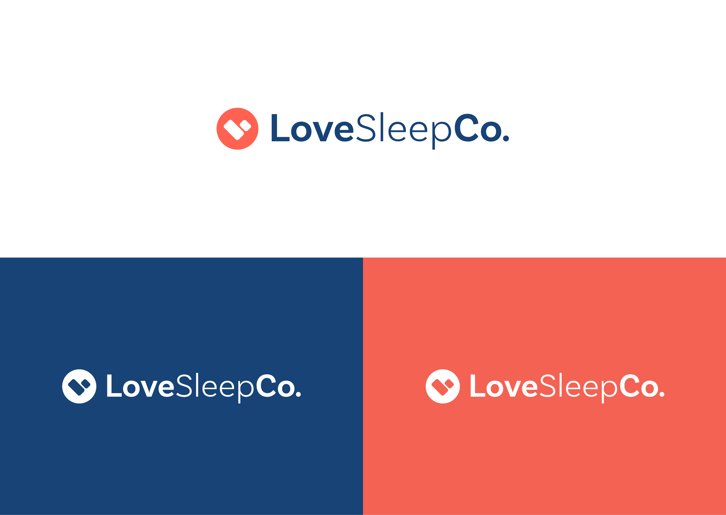
THE LOGOMARK
The LoveSleepCo. logo is playful and friendly. It has a handcrafted feel that consists of a stylized heart icon, a clean sans serif font which divides the words by weight of the typeface. The heart icon is unique to this brand and also represents the letter “L” rotated 45 degrees. The icon is easily recognizable and can be used throughout the branding.

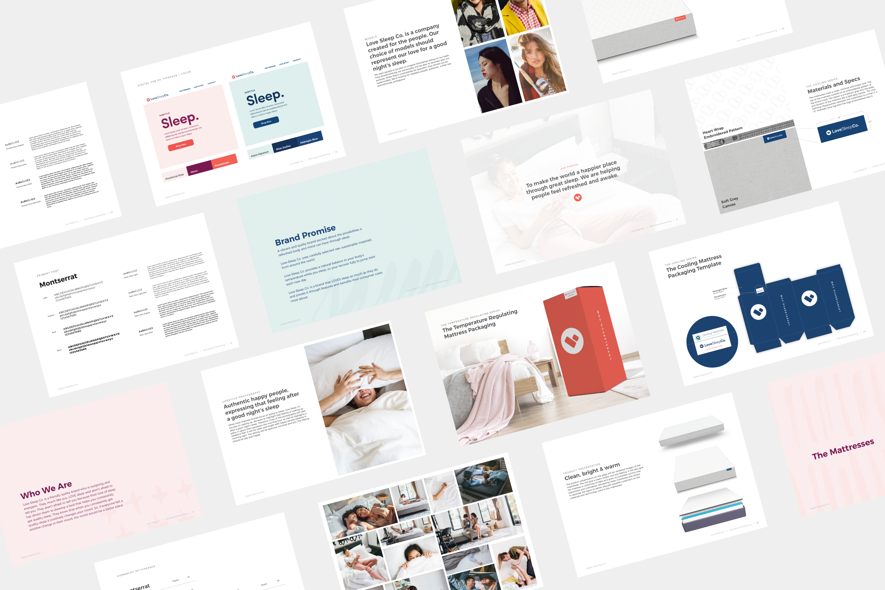
ESTABLISHING A BRAND
While developing the brand, the goal was to establish a framework that could help position LoveSleepCo. as a vibrant and energetic brand through a welcoming color palette, friendly visuals and cheerful photography.
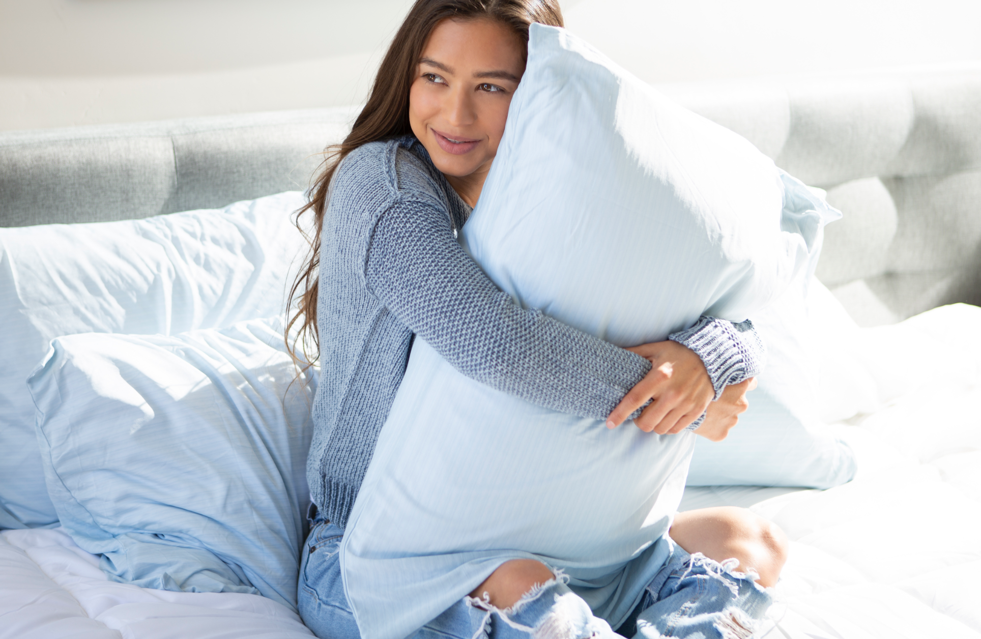
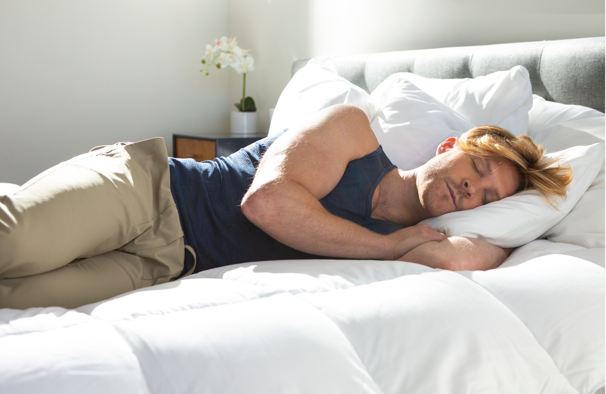
LIFESTYLE PHOTOGRAPHY
While most mattress brands focus on going to sleep, we wanted to focus on waking up, highlighting that feeling of waking up after a great night’s sleep.


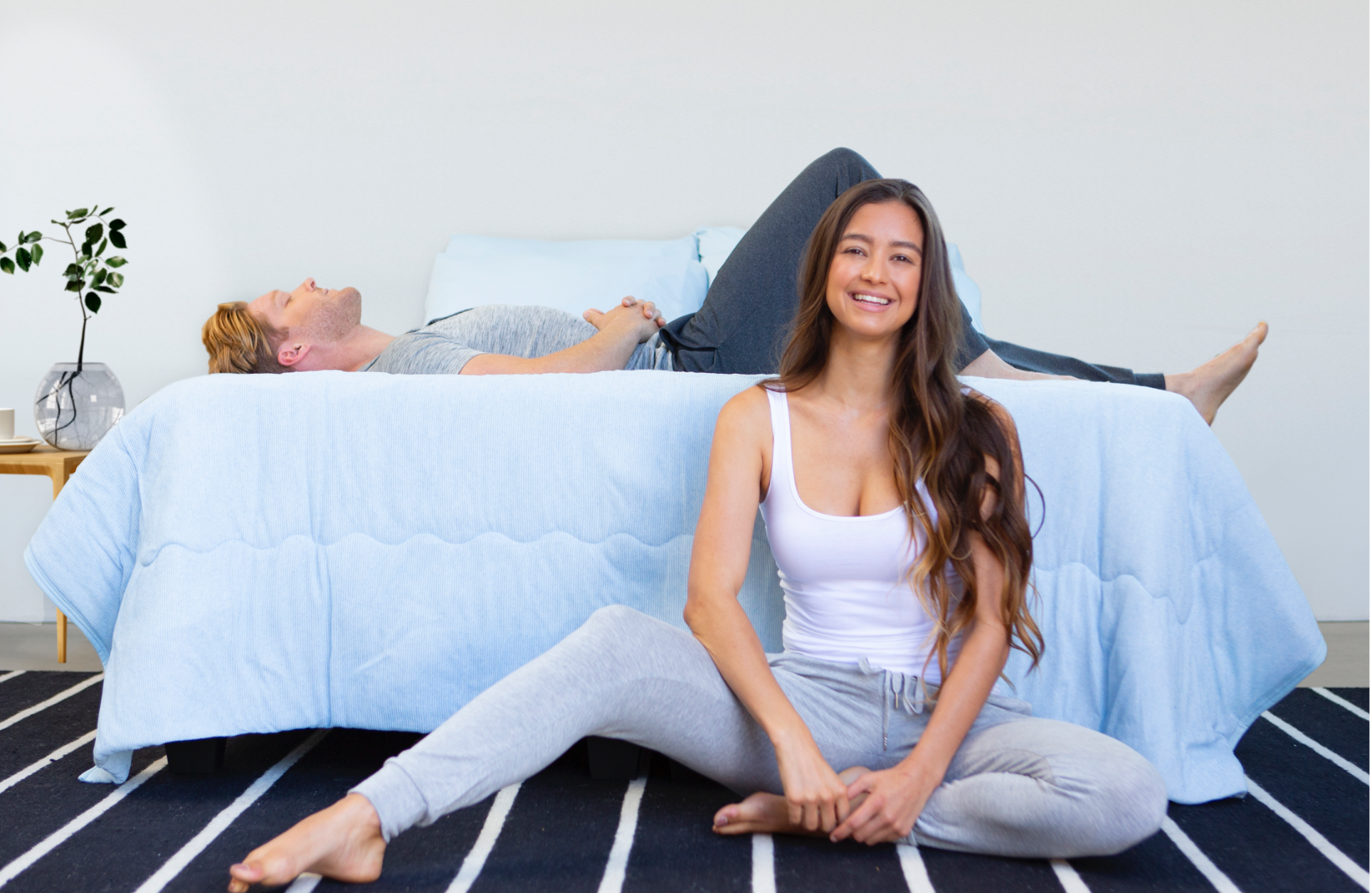


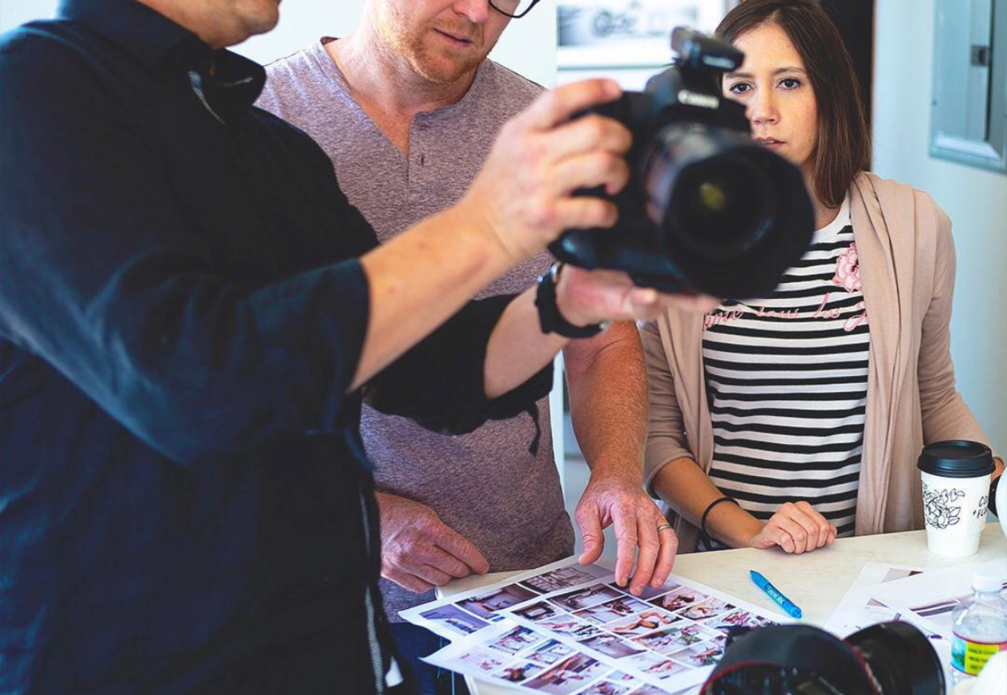
BEHIND THE SCENES
I had the opportunity to assist on the lifestyle photoshoot. I helped establish the photoshoot scenarios for the photographer and assisted in the execution.
BRAND GUIDELINES
In line with establishing the brand as part of the brand positioning, visual assets were created to be utilized across multi-functional materials.
01.
CUSTOM ICON LIBRARY
Designed a set of custom icons for LoveSleepCo. to use across its communications. Motion was added to add interactivity on a digital scale.

02.
PATTERN ELEMENTS
The patterns created were used to emphasize the overall playful and happy personality of the brand.

03.
BRANDED MATTRESS AND PACKAGING DESIGN.
Created a pattern using the heart stylized icon for the mattresses. Also, I developed different packaging for each different mattress.
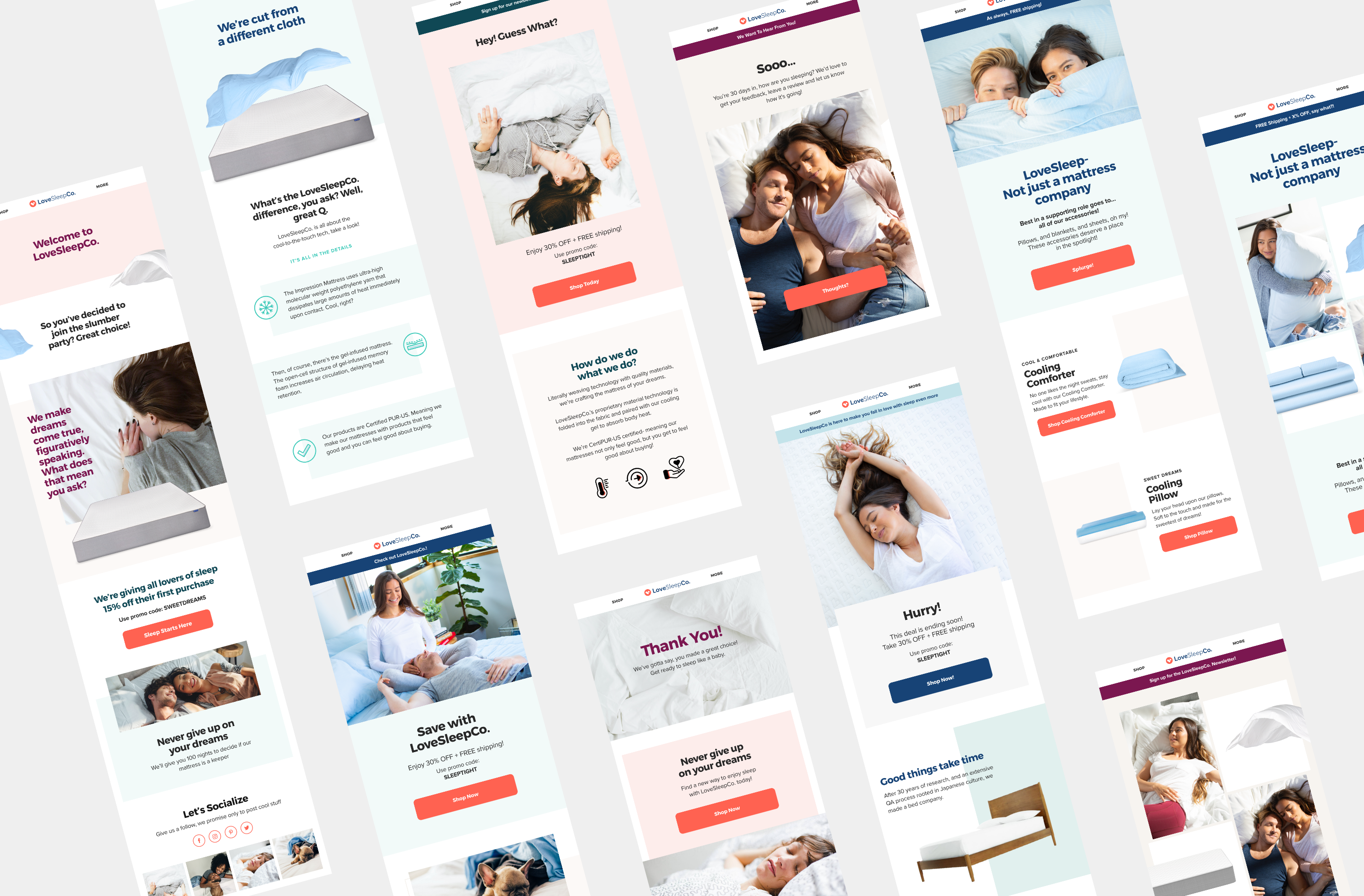
EMAIL MARKETING STRATEGY
As part of the branding guidelines and identity I was able to take part in establishing their email marketing material, helping establish the overall brand.
BROWSE OTHER PROJECTS